The main issues
Inconsistent visuals
The visual style of the app was inconsistent across the different sections.
Inefficient layouts
The layouts were inefficient, with a significant amount of wasted space.
Confusing flows
The app's navigation wasn't straightforward or easy to follow.
Old versus new
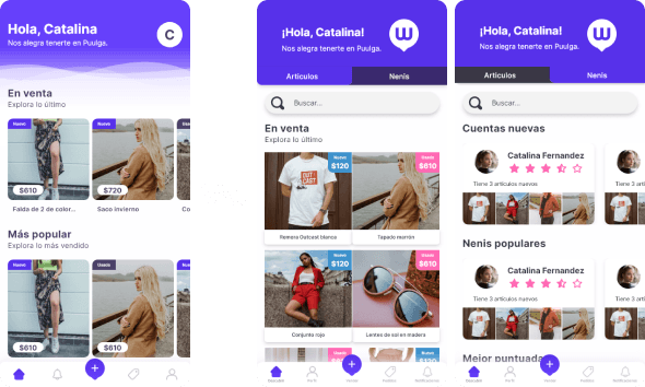
Main screen
The old version felt disjointed and inconsistent, so our first priority was to address that. We also introduced a search bar and split the main screen into sections for articles and sellers, based on research insights.
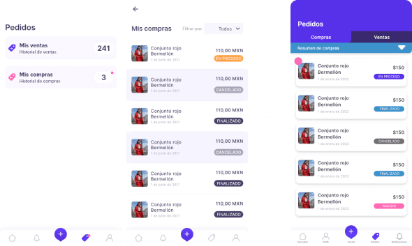
Orders
In this section, we eliminated the first screen and replaced it with a two-tab component. We also added useful analytics in the dropdown menu. Throughout the design process, I focused on maintaining consistency across all elements.4o mini
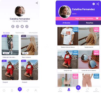


Profile
In this section, we eliminated the first screen and replaced it with a two-tab component. We also added useful analytics in the dropdown menu. Throughout the design process, I focused on maintaining consistency across all elements.4o mini
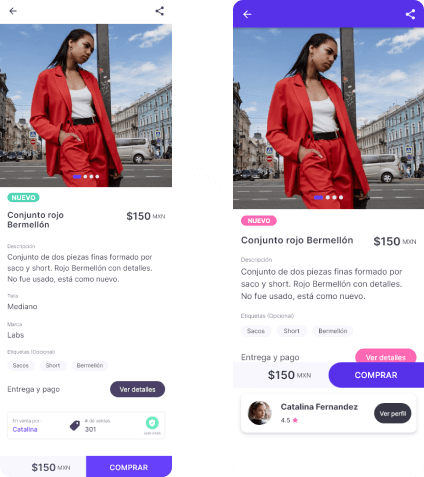
Product detail
Overall, the app now presents a more consistent look, with clearer calls to action achieved through color hierarchy in buttons and sections. I also incorporated repeating components throughout the design, simplifying the user experience by ensuring a uniform interaction pattern across all sections and features.