Basic tokens
Typography
Montserrat Bold
Inter Semi-Bold
Inter Regular
Visual content iconography
Whatsapp emojis and sketch style arrows for visual content.


Colour
#5731E9 / Main colour
#FF68B5 / Accent
#3A296E / Secondary / Dark background
#3A3645 / Dark text
#F8F8F8 / Light background
#FFFFFF / Light text
UI iconography
Filled Google Material Icons for UI elements.


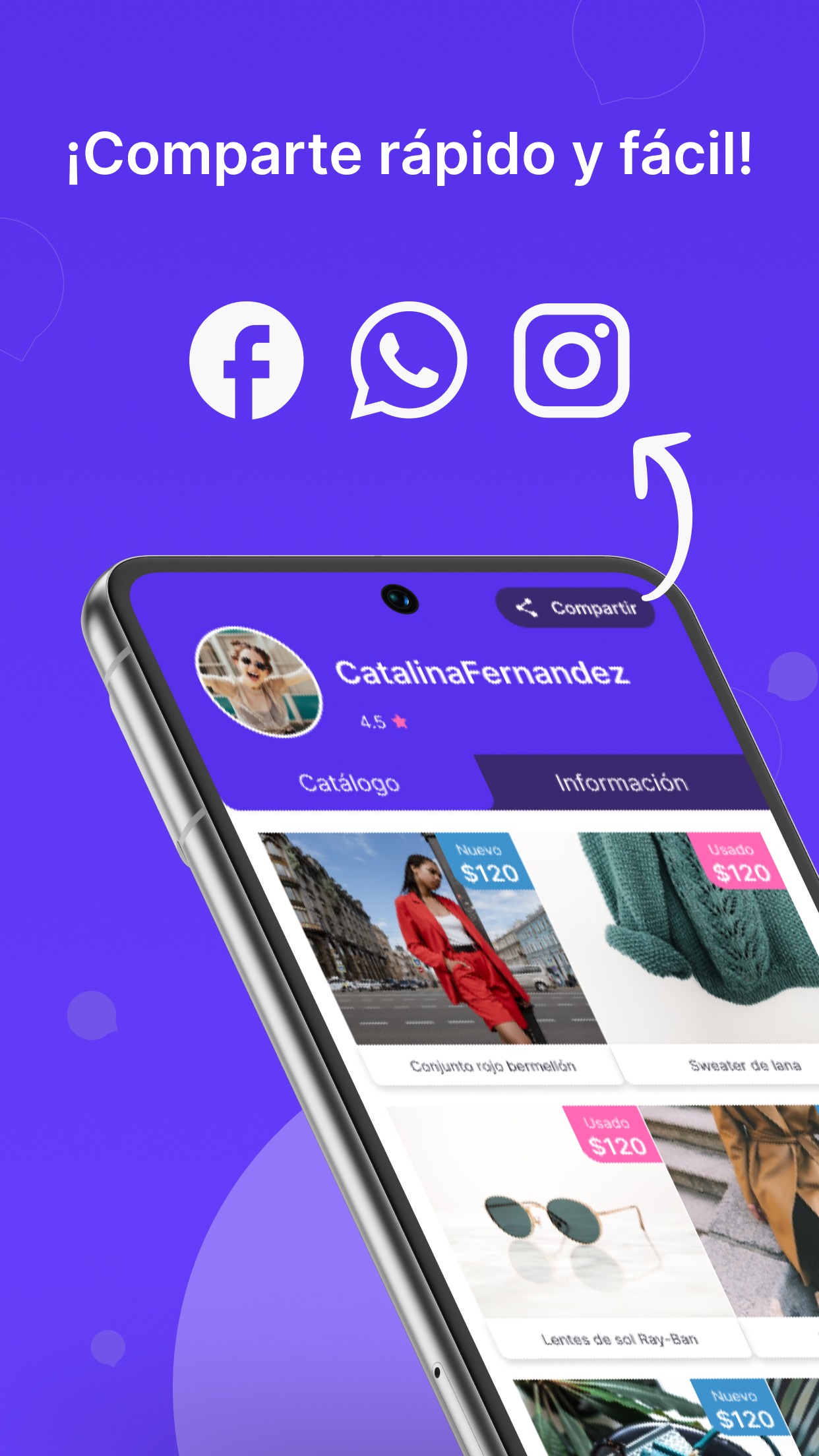
Presentation design
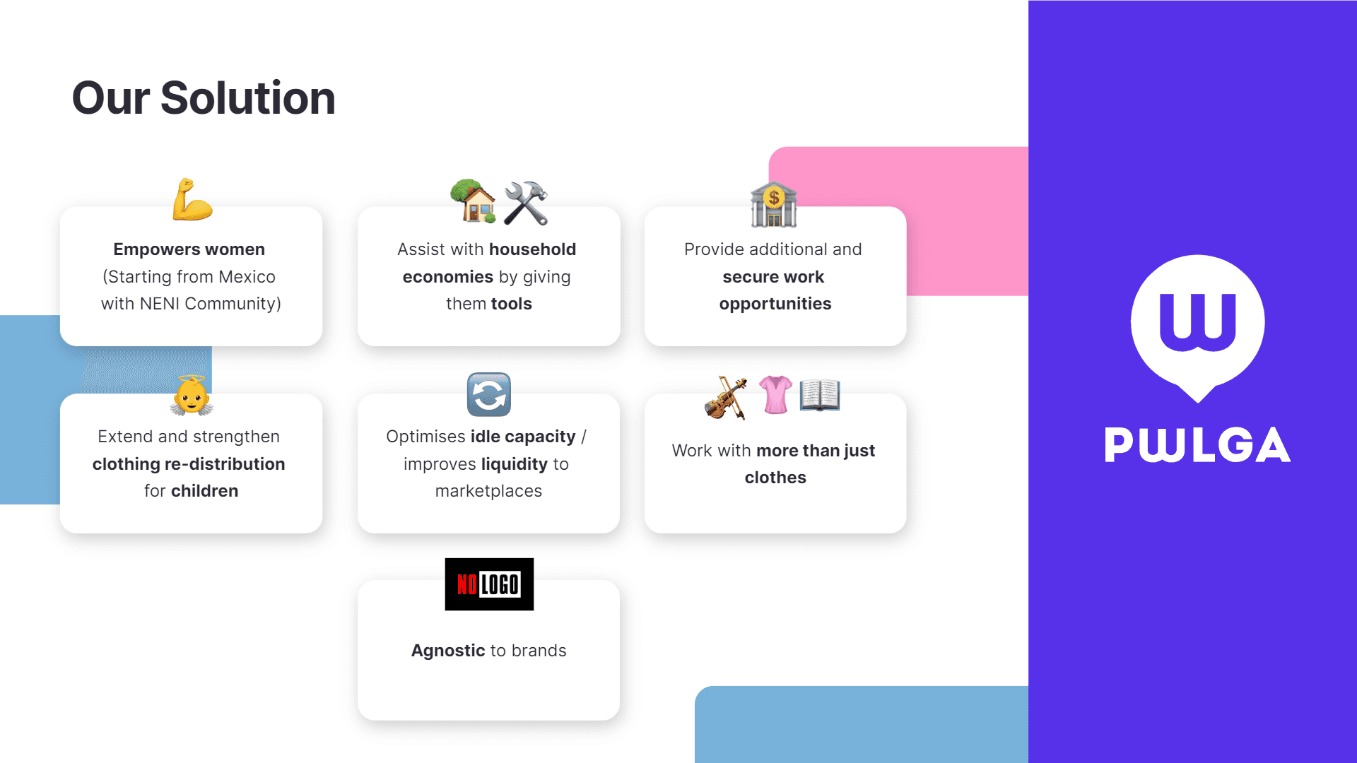
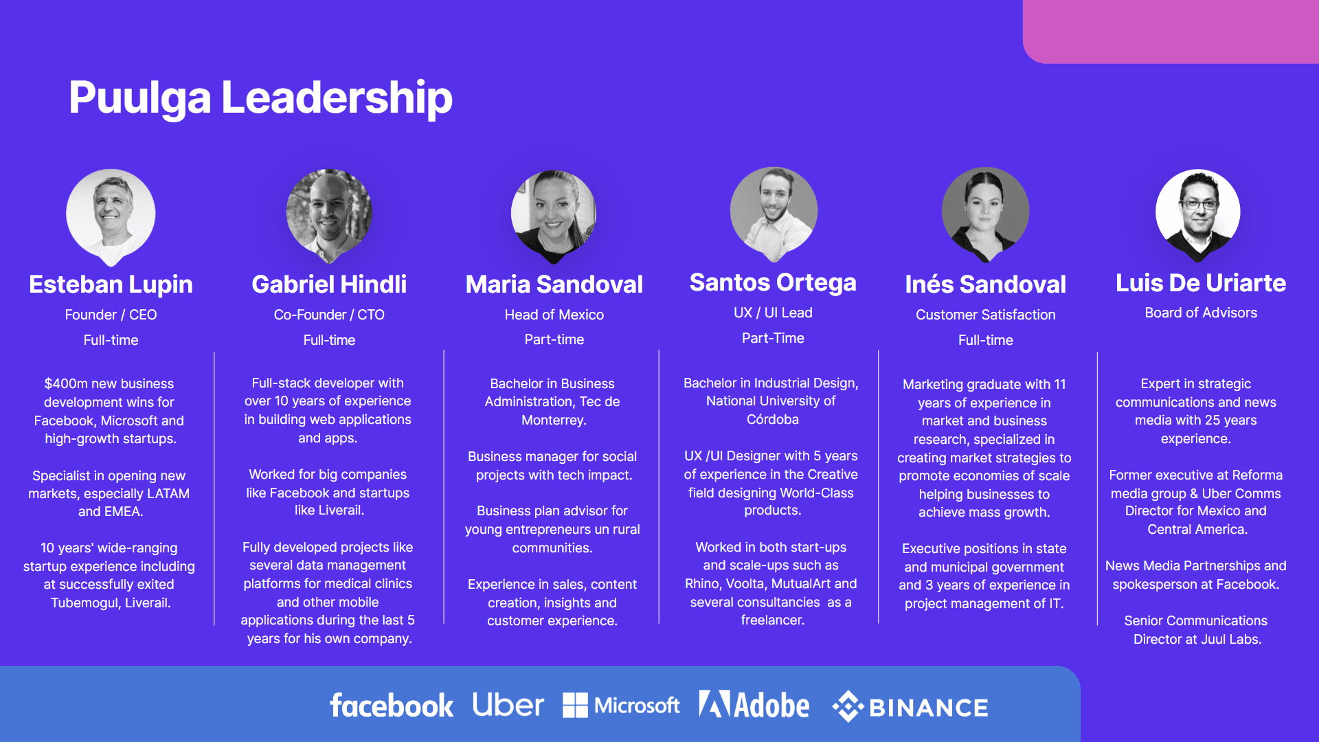
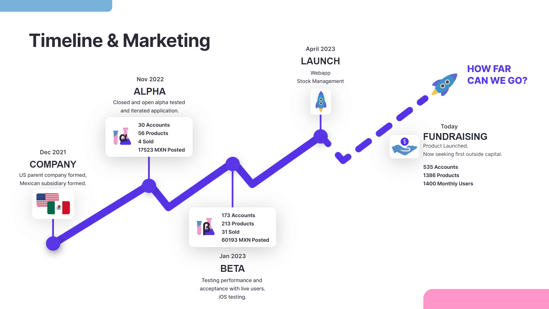
This is part of the pitch deck that the leads used to secure investment for the first phase.


Logo redesign

Old version
The old logo had some problems:
The colours don't match the company's colour palette, it's misaligned and untidy, and it reads as PWLGA instead of PUULGA.
New version
The new version matches the palette, it's properly built following vector best-practices, it's read as PUULGA and looks more modern and clean.