Context

Outdated UI
Mutualart.com has been online for over 15 years, but its UI hasn’t been updated in a long time. The current interface is inconsistent, with mixed styles, colors, fonts, spacing, and misaligned elements.

The userbase
Mostly adults and the elderly with limited tech skills use the services they provide.

The internal problem
This creates frictions between the Dev, Marketing, Management and Design teams, causing money and time losses, besides delivering a less accurate product.
The solution
We created a UI Kit with guidelines using existing web components and parameters, refining the UI to provide all teams with a clear guide. This approach minimizes back-and-forth between design and development, ensuring the final product closely matches the Figma designs.
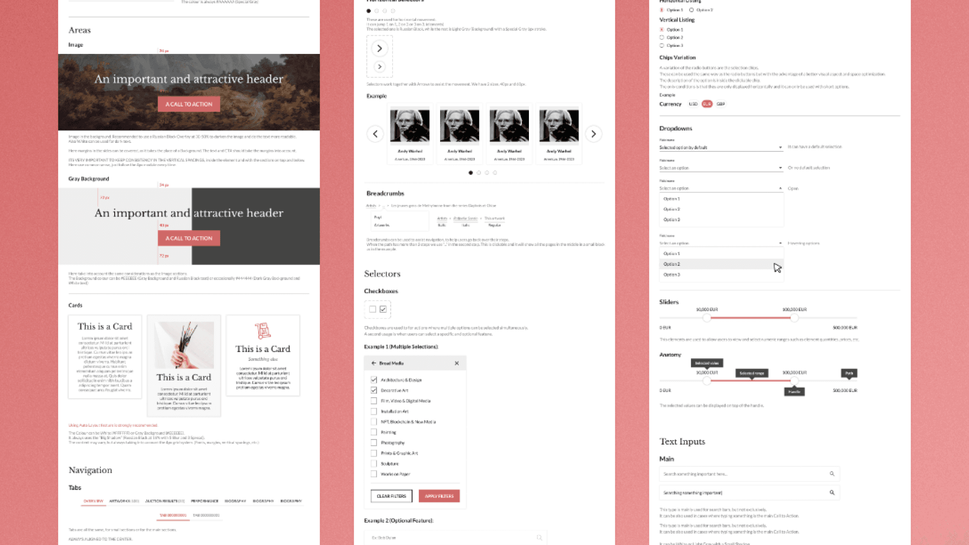
Implemented the 8 pixel grid model
It provides a layout structure and visual organization framework, ensuring developers can maintain design consistency across devices. This "skeleton" manages horizontal and vertical spacing. Since the site is adaptive, not responsive, content won't shrink but will adjust with margins on both sides to fit the space.

UI Kit (preview)
I developed the foundations of a UI Kit for Mutualart to ensure a consistent and scalable website, making it easier to maintain visual coherence across the platform.
It also simplifies the handoff from design to development teams by providing clear, standardized components and guidelines, reducing miscommunication and accelerating the implementation of designs.
Colour
Main
#CD6665 - Primary
#131721 - Secondary
Status
#1B8169 - Positive
#D32020- Negative
Shades of gray
#444444 - Dark
#767676 - Medium
#EEEEEE - Light
#FFFFFF - White
Typography
Header 2
Header 3
Lato Bold - 24px
Header 4
Lato Regular - 24px
Header 5
Lato Bold - 20px
Body
Lato Regular - 16px
Body Small
Lato Regular - 14px
Icons
The icons used are all from Google Material Design iconography. Always using the outlined style, 24px size. (16px exceptionally)
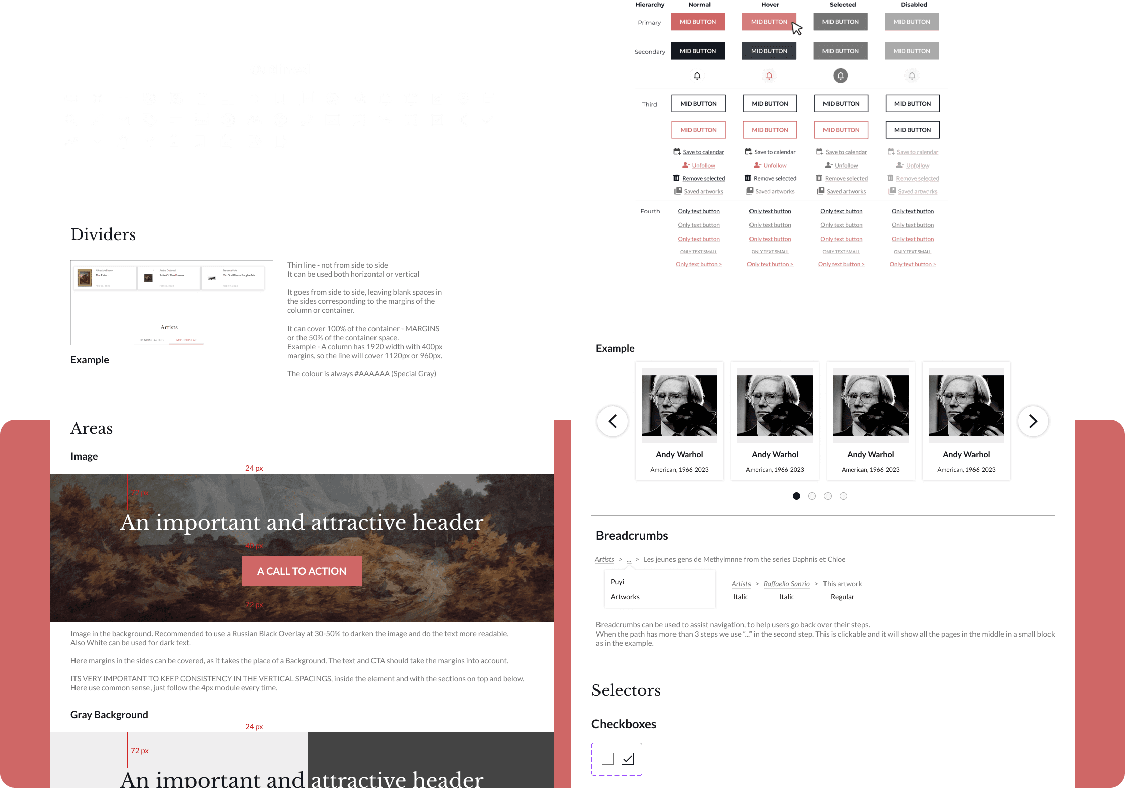
Buttons
BIG BUTTON
BIG BUTTON
BIG BUTTON
BIG BUTTON
BIG BUTTON
BIG BUTTON
MID BUTTON
MID BUTTON
MID BUTTON
MID BUTTON
MID BUTTON
MID BUTTON
SMALL BUTTON
SMALL BUTTON
SMALL BUTTON
SMALL BUTTON
SMALL BUTTON
SMALL BUTTON
Only text button
Only text button
Only text button
Only text button >
ONLY TEXT SMALL
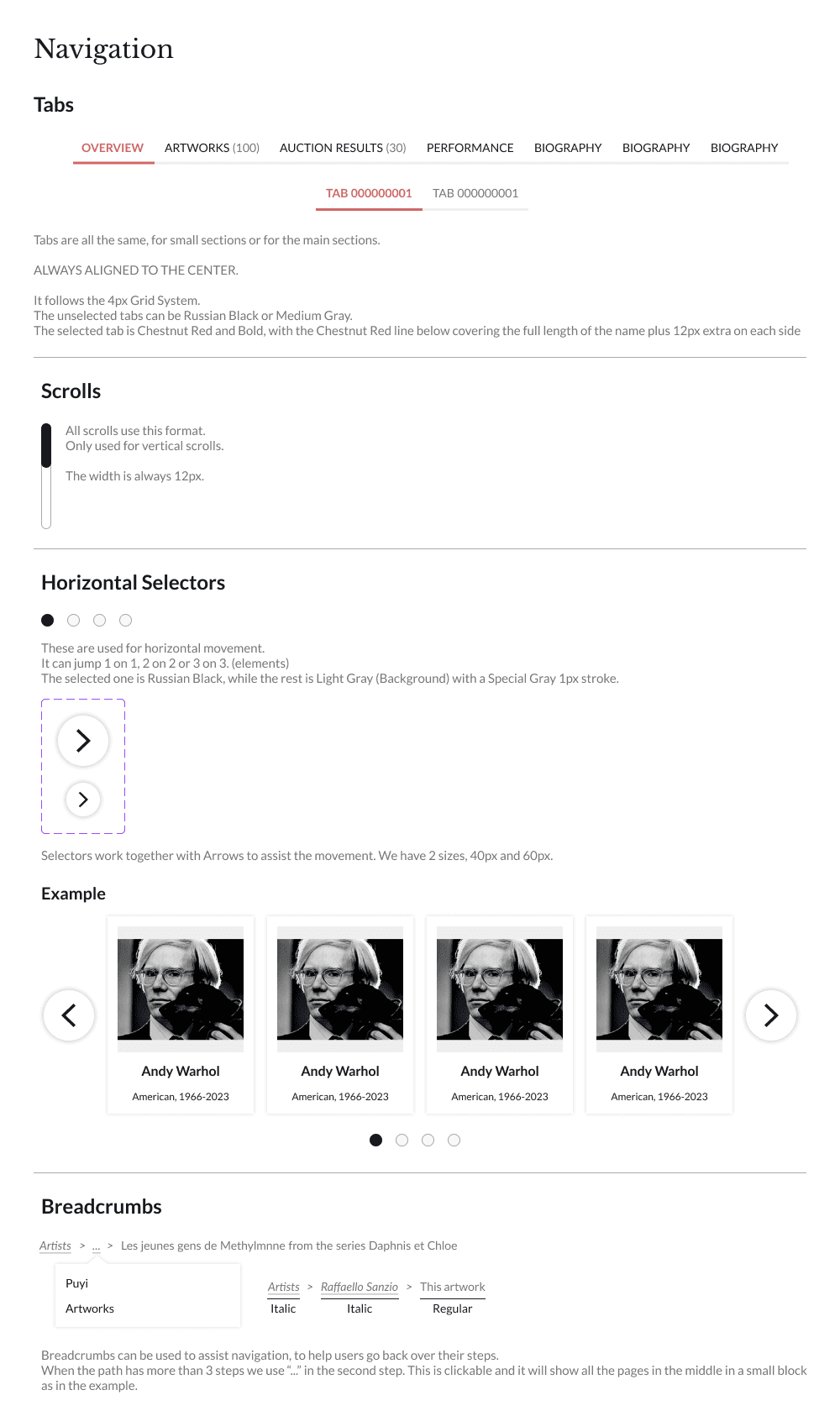
Style Guide
Here I defined some guidelines on how to display content and the proper usage of some elements.
Dates
Letters and numbers (MMM DD, YYYY)
Mar 16, 2023
Letters and numbers without Year (MMM DD)
Mar 16
Measures
Only numbers separated by a “x” with the unit in the end
155,955 x 66,294 mm
Money
Numbers with “,” to mark thousands and currency letters to the right
10,000 GBP
Headers
We never use “.” at the end.
Headers can be aligned to the centre or to the left, NEVER to the right.
Sell your artwork with MutualArt
Description of features - First one only capital
Your Followed Artists at Auction
Title Case for headers
titlecase.com
Buttons
Rectangular buttons are always UPPERCASE AND BOLD.
“Only text buttons” are first letter uppercase only or all uppercase
BROWSE PRICE DATABASE
FOLLOW
Only text button
Only text button >
ONLY TEXT SMALL
Buttons
Always displayed as the action the button accomplishes (Provide clear insight), with the verb in infinitive.
*Not applicable to the buttons or links to go to a section, for example “Followed Artists”
BROWSE PRICE DATABASE
FOLLOW
UNFOLLOW
Some DONT’s
PRICE DATABASE
The action??
GO
Where??
FOLLOWED
So.. this will unfollow??