

Context
With the rise of virtual wallets, managing finances via mobile devices has become the norm, making trips to the bank seem outdated. Users now prioritize speed and efficiency on their mobile devices, so app performance is crucial for customer retention. Currently, the app's long, slow internal flows and inefficient design compromise usability, as it prioritizes security over user experience.
Long flows
The app's long, slow internal flows and inefficient design hinder usability. While users prioritize speed, Macro focuses on security at the expense of efficiency.
Problems with transfers
We have observed that the macro mobile app is not agile when making transfers due to the number of steps to complete, causing a decrease in the retention rate.
Our users
University students from 18 to 24 y/o
People with great knowledge of technology use the app to manage their money (from their parents or a part-time job).
They're learning how the banking environment works.
Full-time employed persons between 18 and 40 y/o
People with autonomy in the use of technology.
Paid workers who receive their salary through Banco Macro and use the app to manage their money, make transfers and pay bills.
Full-time workers between 40 and 60 y/o
People with little autonomy in the use of technology.
They have their money in Banco Macro and use the app to manage their money for the home, make transfers and pay for services.
How do we get insights?
I did four interviews belonging to the different proposed archetypes.
They were semi-structured informal interviews with the aim of understanding more deeply the frictions in the use of the mobile app when making transfers in order to create a more positive experience for customers.
Introduction
Preliminar interviews, research over Macro App.
Author: Santos Ortega, UX Designer.
Date: 18/10/2022
Research objectives: We want to find out if the transfer process is intuitive and fast enough for users, as well as how often they do it, and see if it is possible to reduce the number of steps to complete the task.
Research
Are there any steps that users get stuck on?
What can we improve in the User Flow?
Can users easily make bank transfers?
Can users figure out how to transfer quickly?
Is there a piece of information missing that can help users?
Users, do they prefer speed or security when using your banking app?
How was the user experience?

Jeronimo Pelaez
23 y/o
Macro app user for 4 years.
He has a savings account in pesos.
Law Student
He works part-time in a law firm in the centre of Córdoba.
Bio
I've been a Banco Macro user since opening my first account, managing my salary and finances through it. With a busy schedule balancing work, study, and personal time, I value efficiency. I prefer tasks, including banking, to be quick and seamless to avoid interrupting my day.
Motivations
Since my free time is limited, I prefer to handle everything digitally for speed and convenience, especially since public transport is slow. I'm motivated by staying organized and keeping track of my expenses and bills. I want to manage my finances independently as I get older, without relying on an accountant or anyone else.
Frustrations
Hypothetical scenario
Expectations of success

Quotes from real users
😥
“I would like that while transferring, give the option to schedule the recipient at the time you enter their data. Or if you can't do that at the same time see the option to make it more fluid and within the process. It is not comfortable to do it later.”
💭
“It is easy to use, the process is direct and clear”
😡
"I think that excessive verifications or verifications in more than one step should be done from certain amounts or in certain transactions, not for a thousand pesos, nobody is going to want to steal them from you."
😡
"I think that as soon as you finish transferring, the first thing I would have to do is show you the receipt for one, after all, one is generally what you need, either to check if everything is ok or to send it to the recipient."
😥
"If it wasn't for the token I wouldn't have any problems, but that prevented me from transferring a lot of time because I didn't know how to do it and when I did something went wrong and I had to do it again"
Information Architecture
This is a graphic with the current architecture. I created this to have it as a guide to be able to identify the structure and the potential problems with it.

Tree testing
The study aimed to assess the current architecture and identify where users were struggling with various flows. I focused on testing the transfer process and sharing receipts, which previous research highlighted as the most problematic areas.
Results overview
Routes

Findings
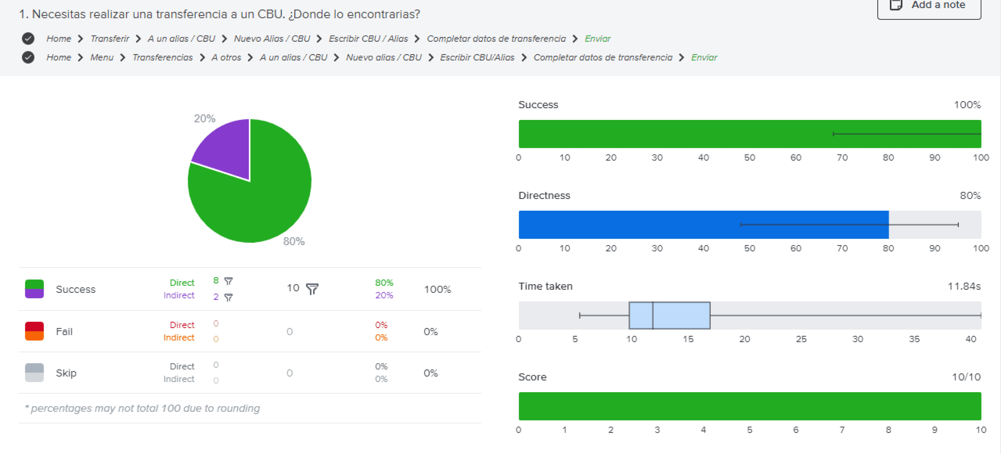
Task 1
Task 1 has no major problems.
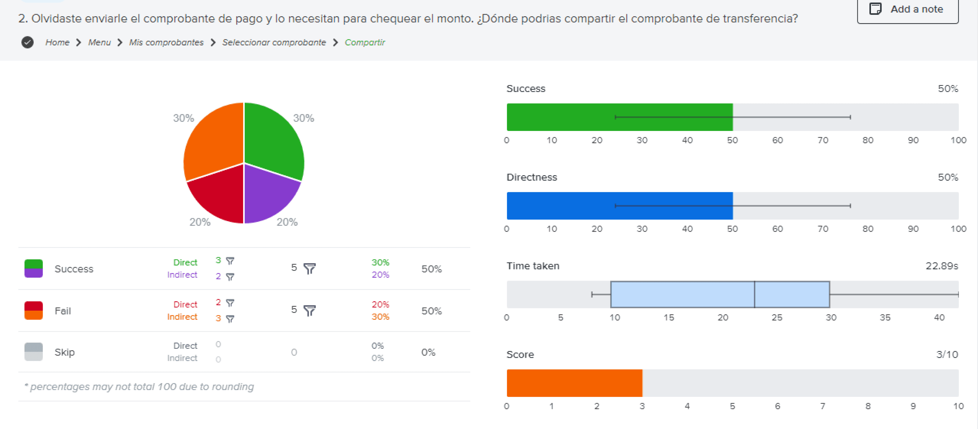
Task 2
In Task 2, we found that users struggled with the objective, as 50% made mistakes when sharing receipts.
Additionally, 20% completed the task indirectly, indicating the process needs to be more efficient. Many users searched for the receipt in their account details or the agenda within the transfer option.
New information architecture
This is the proposed architecture taking into account the research carried out, and the insights from it.

Voice and tone
We define the company's voice, imaginary concepts and central words that provide us with a guide to the company's identity.

Across the user flow

Style guide

Designing the new screens
I made a few drafts and digital wireframes and voted for the best solutions within the team.
Flow 1 / Transfer money
1
User enters with pattern
2
Goes to the transfer section
3
Fills the transfer details
4
Completes with Alias/CBU
5
Selects to an Alias/CBU
6
Confirms the transfer
Flow 2 / Share a receipt
1
User enters with pattern
2
Open the "last transfers" dropdown
3
Selects the transfer to share
4
Shares the receipt via native UI
Basic elements
Colour
#142D52 / Primary
#214780 / Secondary
#8E8E8E / Grey background
#FFFFFF / White
Typography
Inter Bold
Inter Regular
Illustrations
Linear and representative (conceptual) illustrations, not of real people or objects.
UI iconography
Filled Google Material Icons for UI elements.


Columns
4
Gutter
16
Margins
16
Vertical spacing
8, 16, 24, 32, 40, 48
Final UI designs
These are the final screens for both flows.
Simplified, easier, more professional.
