Logo design
I wanted to create a modern and simple logo that is easily connected with cinemas and movies, while staying away from the classic cinema camera or the popcorn bag.
The process
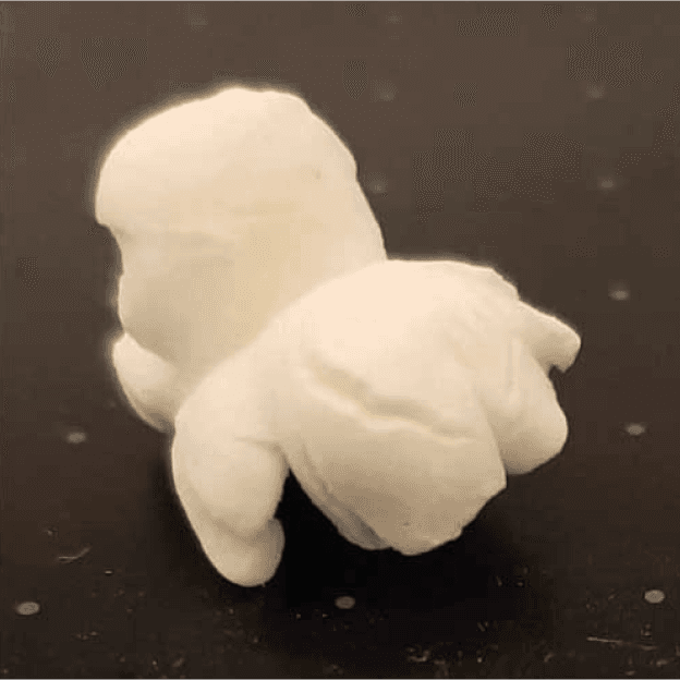
After a few sketches, I ended up with the idea of doing a single popcorn, but in the style of Apple's logo. the problem is, how is a popcorn? Nobody ever stopped to look them in detail, so I did.


The results
After some cleaning, I got the logo I was trying to get. Simple, not obvious, but still recognizable.


Colour
#D25F3A / Primary
#F08805 / Secondary
#0C1426 / Dark background
#FFFFFF / White
Typography
Readex Pro Medium
Lato Regular
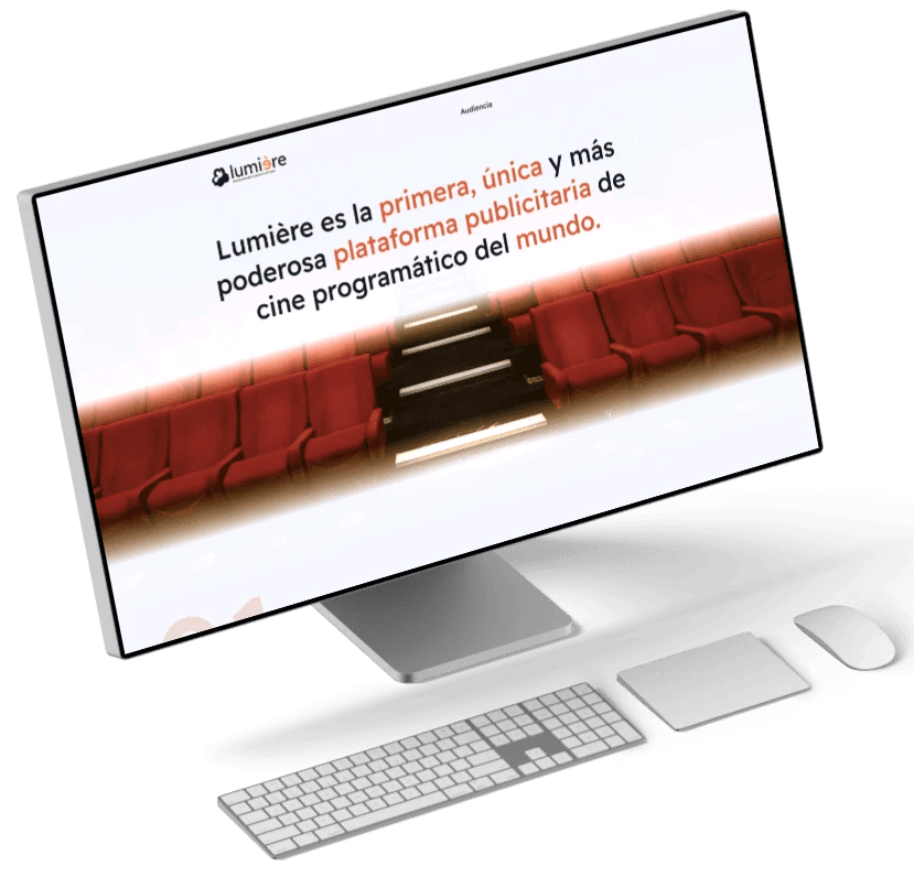
Main page
Here we want to encourage clients to book a demo, by highlighting the platform's key features and benefits. We also show the potential audience and the countries they operate in, showing how the platform can address their specific needs. This helps visitors understand the value the solution offers and encourages them to engage further.
