
Context
Enterprise IT procurement is outdated and urgently needs digital transformation. The current process is slow, costly, and fragmented, leading to significant inefficiencies.
Our users are company employees looking to purchase technology products and services like Cyber Security, Colocation Data Centres and Hardware.
The problems
🕔
Time waste
There are 14 steps from the Information gathering to the Vendor selection, and each step takes between 2 and 3 weeks.
💸
High consulting fees
Agents take up to 20% commissions (They only connect buyers with sellers) and consultants take £20-50k of consulting fees.
🚥
Difficult process
The entire process is very long and normally completed just once to secure long-term contracts (12-36 months). As a result, most users are unfamiliar with the process and struggle to navigate it.
The goal
To build an online platform to fix the current inefficiencies, fragmentation and cost challenges faced in the IT marketplace by creating a smart-match system that connects the buyers with the best fit sellers simply and quickly.

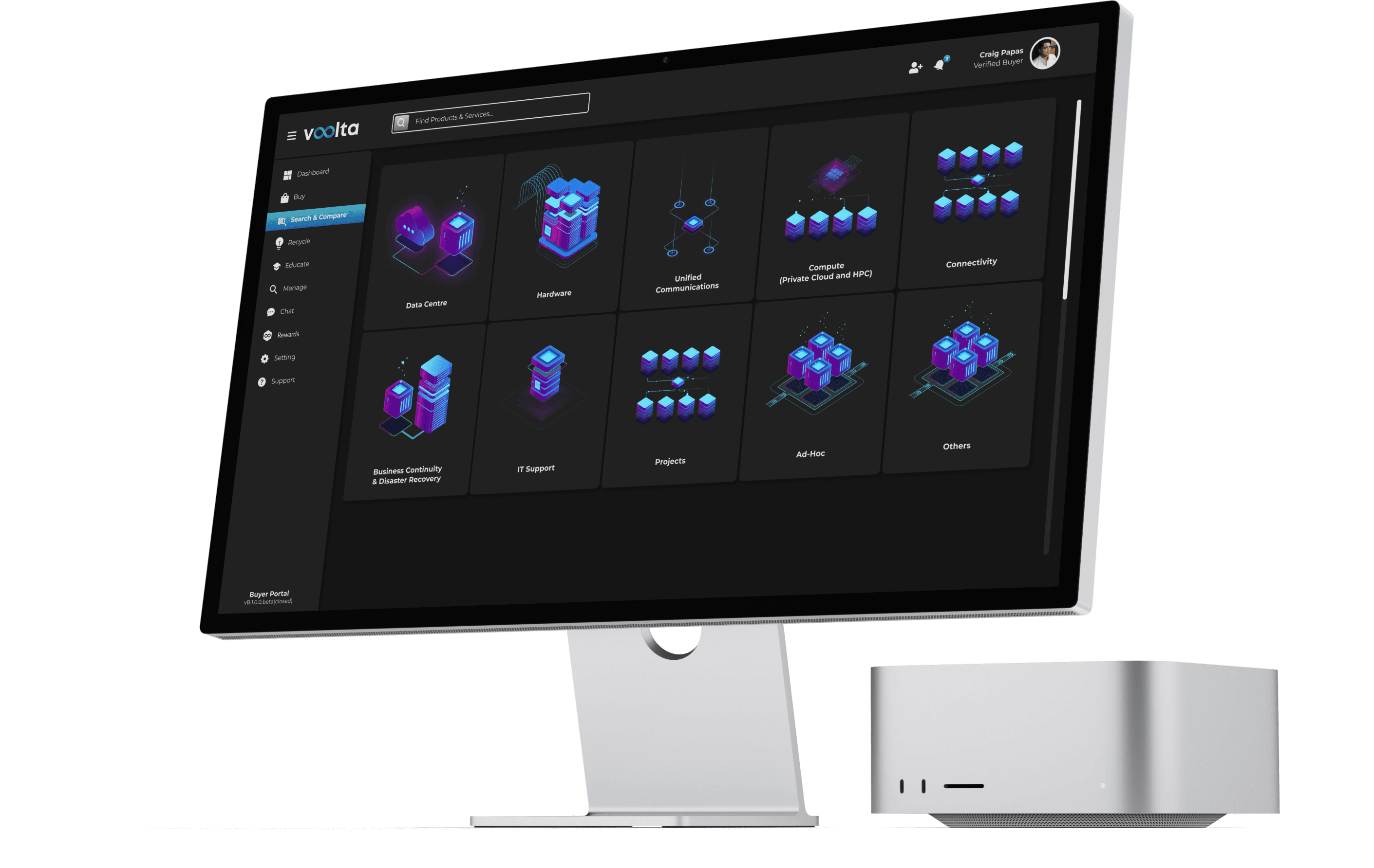
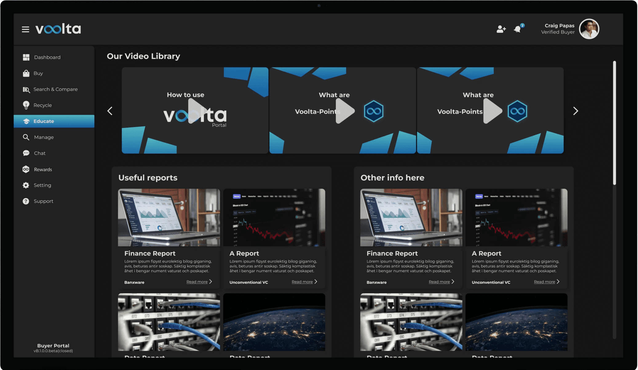
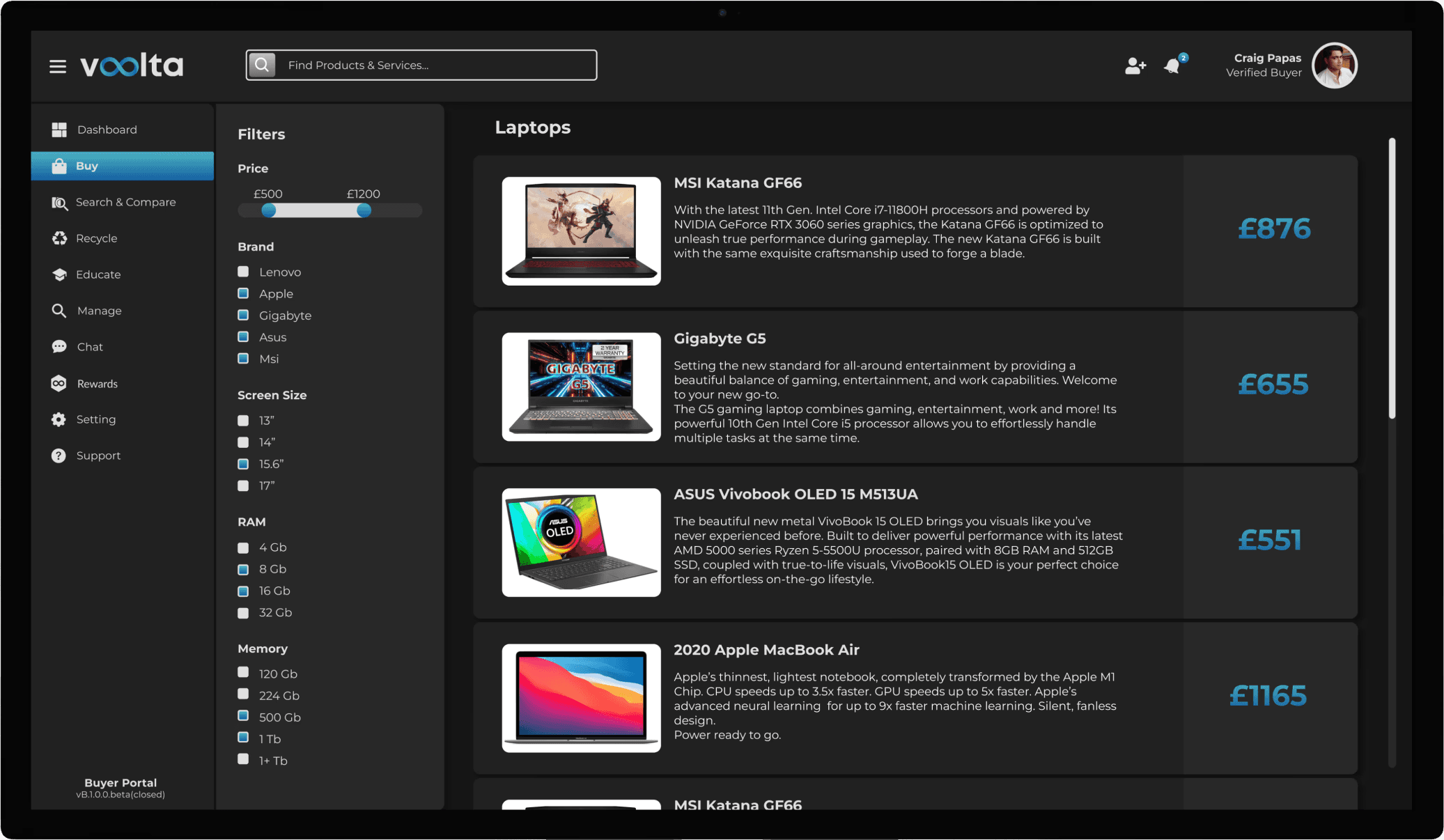
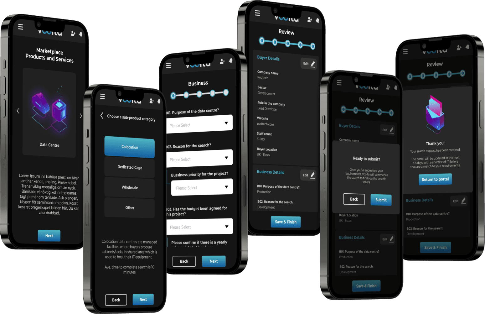
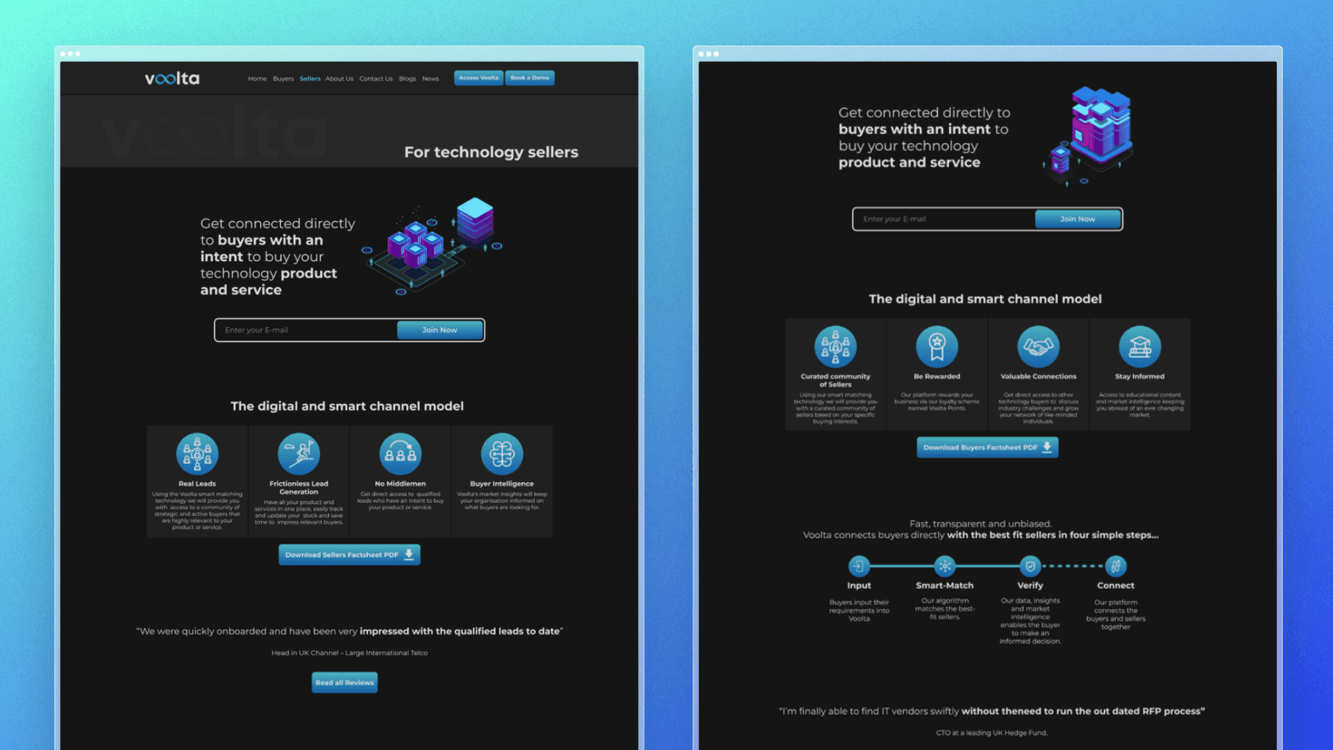
The procuring portal
This is the product, where IT buyers can connect with service and hardware providers.
Buyers can purchase products, compare different offers, learn about each sector, chat with sellers, earn rewards and donate a percentage of the money they invested to charity.


UI Kit (preview)
I developed the foundations of a UI Kit for Voolta to ensure a consistent and scalable design system, making it easier to maintain visual coherence across the platform.
It also simplifies the handoff from design to development teams by providing clear, standardized components and guidelines, reducing miscommunication and accelerating the implementation of designs.
Colour
Main
#4EB6C2/#135DA2 - Main gradient
#4EB6C2 - Primary
Status
#00DB58 - Positive feedback
#DAB046 - Warning / Alert
#FF0000 - Negative feedback
Shades of gray
#212121 - Dark
#282828 - Dark 2
#353535 - Dark 3
#8E8E8E - Light
#E1E0E0 - White
Typography
Heading 1
Montserrat 30 Bold
Heading 2
Montserrat 20 Bold
Subtitle
Montserrat 15 Bold
Body
Montserrat 15 Regular
Icons
Buttons
Primary
Primary hover
Secondary
Secondary hover
Radio
Components
Range bar
£500
£1200
Current image display
Searchbar
Find Products & Services...
Text input
Dropdown
Please Select
Web designs
We designed the website to showcase Voolta's key features, highlighting how it addresses inefficiencies in IT procurement by simplifying the process. The site also introduces our team and explains our mission, building trust and clearly conveying the value and impact of our solution.


“I’m always surprised with your delivery speed”
“It’s great how you get the idea of what we need at the first attempt.”
Comments from the team